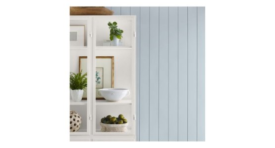
Upward, a light blue with a touch of grey, is an ideal color for interiors, exteriors and aerospace.

Upward SW 6239 is Sherwin-Williams’s 2024 Color of the Year. (Source: Sherwin-Williams)
David Savastano, Contributing Editor10.09.23
Blue is a color that almost everyone enjoys. It conveys a sense of nature, of calm, of hopefulness. Upward, Sherwin-Williams’ 2024 Color of the Year, fits that sensibility perfectly. Sue Wadden, director of color marketing, Sherwin-Williams, says that Upward is a “really peaceful color.”
“Upward SW 6239 is a light and airy blue with a little bit of grey, a little bit of lightness and a touch of periwinkle that makes it ethereal,” added Wadden. “It is a really peaceful color that evokes happiness and positivity, creating a calm environment in any room homeowners choose to apply it to. I think it can work well both inside and outside of the home.”
For example, Upward can be used as an accent color on a white exterior.
“A fun way to incorporate it outdoors is using it on your front door, especially if you have a white exterior,” said Wadden. “Inside of the home, it works almost everywhere, it’s a very versatile color. I love using it in respite rooms where homeowners look for rest after a long day, like a bedroom but it also looks great in kitchens and bathrooms.”
Wadden said there are a number of key factors that go into selecting Sherwin-Williams’s Color of the Year.
“The research that goes behind it is key here,” Wadden said. “We want to recognize where this directional color is going and why it’s important. We’re continuing the trend of nature-inspired colors but shifting from earthy greens to ethereal blues. We want to respond to trends, but we also knew we wanted to play up a blue color. We’ve seen silvery blues are going to be important in Europe, we wanted to figure out how to translate that to not only the North American market but also find a color that appeals and resonates globally. It’s all about translating what a trend is and finding the right way to embody that in architecture.”
Last year, Sherwin-Williams named Redend Point, a blush-beige hue, as its 2023 Color of the Year. Wadden said that Upward pairs perfectly with Redend Point.
“It does pair well with Redend Point SW 9081,” Wadden confirmed. “We like to switch between warm and cool colors each year to create a balance point while keeping the harmony between both colors.”
Upward is part of Palette No. 1 in Sherwin-Williams Colormix® Forecast 2024, Anthology: Volume One. Wadden recommends pairing Upward with the palette’s blues, greens, deeps and darks in the palette, which includes Snowbound SW 7004, Drift of Mist SW 9166, Gale Force SW 7605, Tricorn Black SW 6528, Honeydew SW 6428, Palm Leaf SW 7735 and Antiquarian Brown SW 0045, and added that one of the best colors to pair with Upward SW 6239 is white.
“Together they create a coastal-chic vibe we believe will be very big in the coming years,” she added. “I recommend using white paint colors like Snowbound SW 7004 or Drift of Mist SW 9166. For an even stronger coastal vibe, homeowners can pair the color with a navy such as Gale Force SW 7605.
A fun pairing for Upward would be a soft pastel green, like Honeydew SW 6428, which creates a subtly playful environment. Upward SW 6239 also pairs well with warm browns like Antiquarian Brown SW 0045 and even with brown wooden furniture.”
Sherwin-Williams’ paints are well known in the home market, but the company is a leader in more coatings segments, most notably aerospace, and Upward fits in nicely there.
“Even though we’re talking about Upward SW 6239 mostly in the home interior space, I can see it in commercial spaces as well, especially aerospace,” Wadden said. “The color has an almost silver iridescence that would be applicable there and in other technological spaces.”
In celebration of announcing the color, Sherwin-Williams is collaborating with Dominique Ansel, a James Beard Award-winning French pastry chef, to create his first-ever vegan Cronut inspired by Upward SW 6239.
The Cronut, a “half croissant, half doughnut” pastry, was available for a limited time at Ansel’s bakery in New York City's Soho neighborhood. It is the shade of Upward, and is filled with coconut riz au lait (rice pudding) and infused with naturally-flavored Butterfly Pea Flower Tea.
“Not only am I excited about our choice for Color of the Year and giving Upward SW 6239 the recognition it deserves, but I also can’t wait to see our partnership with Dominque Ansel to create his first-ever vegan Cronut inspired by Upward SW 6239 come to life,” Wadden said. “It’s such an unexpected partnership, but it really shows how color can be impactful in all markets – even food and wine!”

